Fountains of Reign: Kansas City Royals Unveil New City Connect Uniform
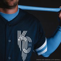
Hey, hey, hey, hey! This morning the Kansas City Royals unveiled its Nike MLB City Connect uniform, the third of seven teams scheduled for the 2022 season.
Slated to debut in their Saturday game against the New York Yankees, the uniform combines the architecture and abundant fountains of Kansas City with the history of the Royals franchise as well as a journey through the decades of the game. baseball days in western Missouri.
SHOP: Kansas City Royals City Connect jerseys, caps and more available now!!
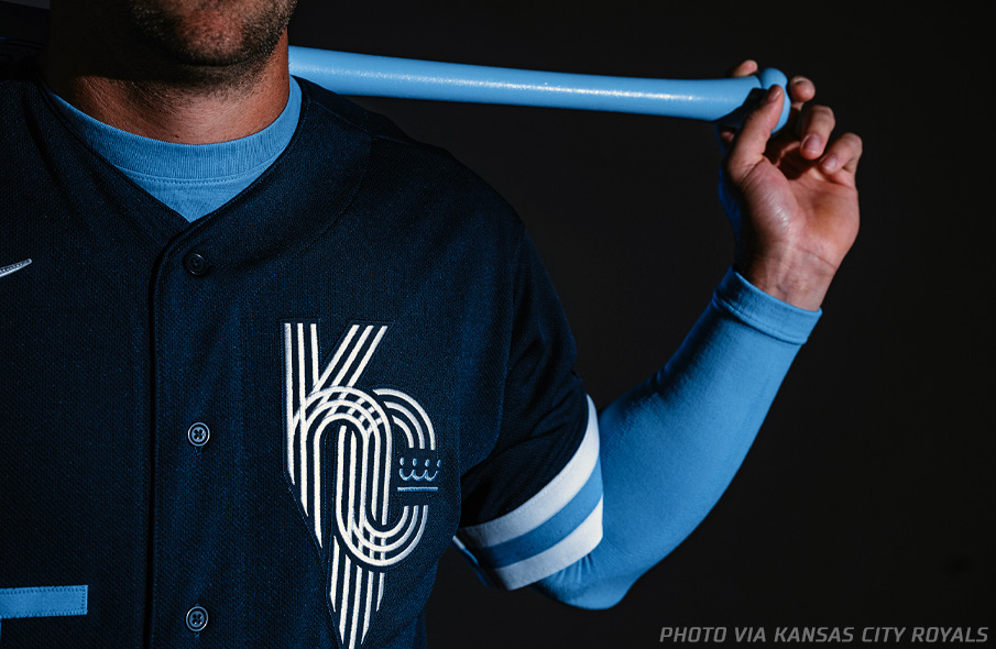
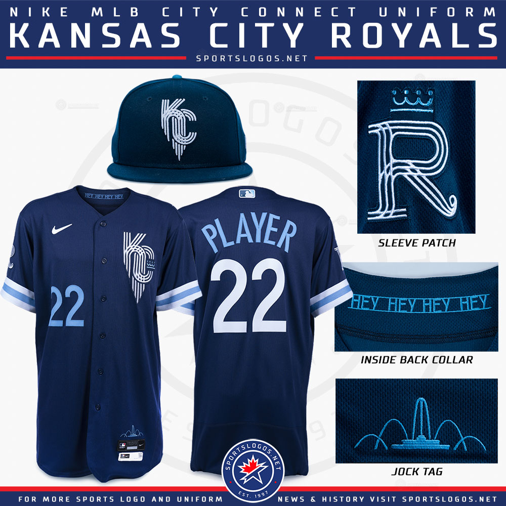
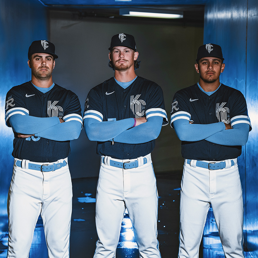
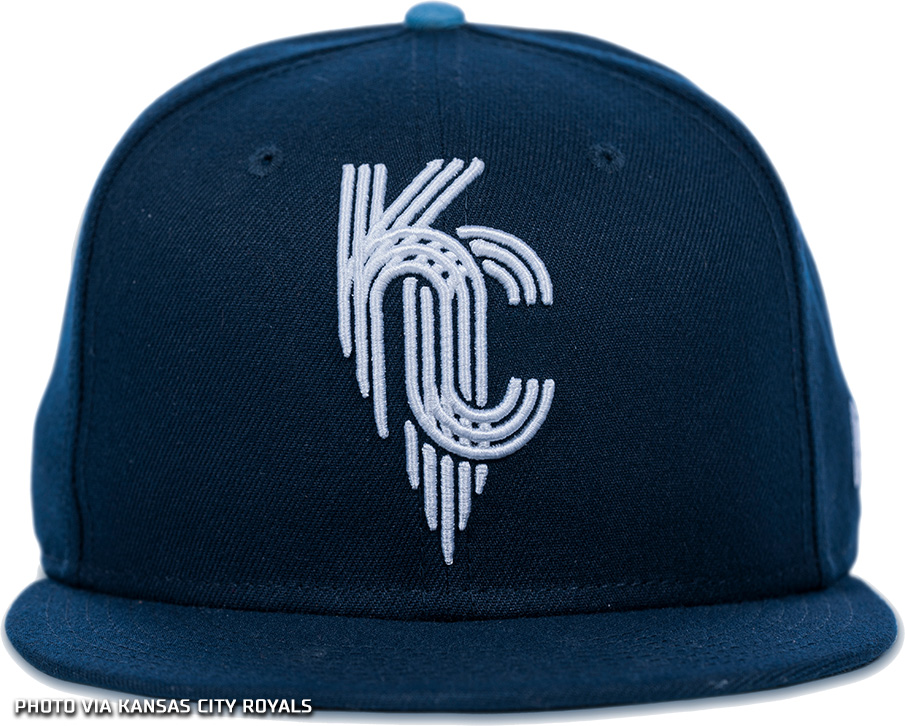
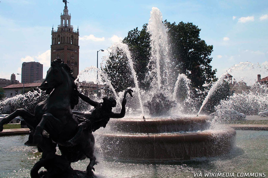
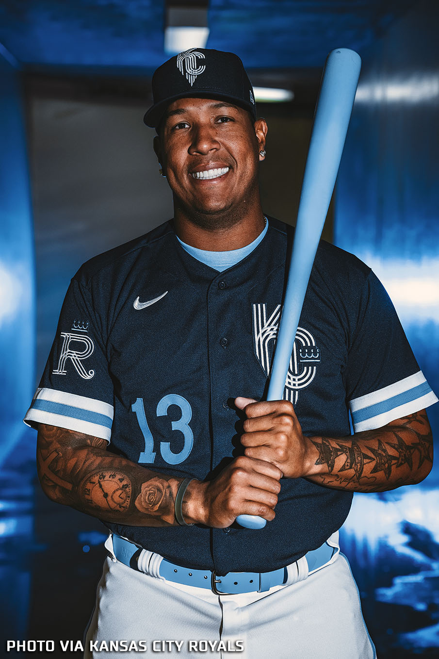
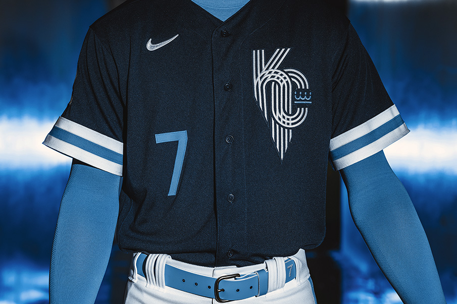
The Nike team and the Royals made Kansas City’s “City of Fountains” moniker the main focus of the uniform design. The navy cap and jersey prominently feature a new “KC” logo created by Nike and Kansas Citian designer Jason Wright, inspired by the municipal flag of the city of Kansas City. A powder blue fountain is also incorporated into the “jock tag” in the lower left corner of the front of the jersey. Originally installed to relieve horses pulling carriages through the city, the city’s fountains have since become one of Kansas City’s most iconic symbols, causing a stir even beyond the fences of Kauffman Stadium, the Royals baseball stadium.
Navy blue is the dominant color of this set; It’s a nod to the professional baseball teams that called Kansas City home before the Royals’ expansion season in 1969. The Federal League Packersthe negro leagues Monarchsand the American League Athletics all have used navy blue as their primary color at one time or another. The powder blue acts as a secondary color, a tribute to the history of the Royals uniform, through the sashes, stripes on the sides of the pants, and both the player number on the lower right on the front of the jersey and the player’s name on the back.
“This design is one that fans of all ages can really appreciate,” said Kansas City Royals President and CEO John Sherman. “From the fountains that are part of Kansas City’s heritage to the jersey colors signifying the rich history of baseball and the Kansas City Royals. The uniform highlights the distinct elements of our community.
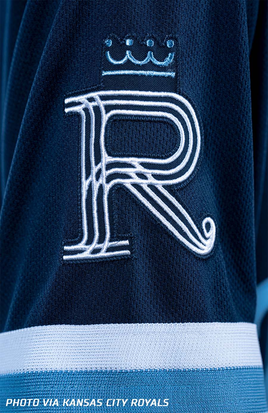
On each sleeve are three thick stripes, one powder blue with two white on either side, a nod to the prominent stripes on the sleeves of the sweaters worn by the 1985 World Series champion Royals. On the right sleeve is a letter “R”, similar in style to the fountain-KC on the chest, with a crown above; that recognizes the original Royals logo, a large white “R” on a blue field with a crown above. Inside the back collar are the words “HEY HEY HEY HEY”, a reference to the 1964 Beatles song “Kansas City/Hey, Hey, Hey, Hey”, which is Played after every Royals home win. The player’s name and number are inspired by the city’s art deco architecture on the front and back.
“Our number one goal was to develop a platform that united the Kansas City community,” Sarah Tourville, Kansas City Royals chief revenue and innovation officer, explained on a call with SportsLogos.Net. “A focal point of our design, the new Kansas City Fountain logo reflecting the ‘art deco’ style architecture throughout the city, pays homage to the history and tradition of fountains throughout the city. Fountains have become one of the most iconic symbols that adorn the streets, the flag and now even our uniforms.
Nike, which launched the league-wide City Connect uniform program with Major League Baseball on the eve of the 2021 season, approached the Royals with the idea of working on a uniform for the series though. before plans for the additional uniform option were announced.
“We were presented with the opportunity over two years ago. Nike informed us that they would like us to participate in the second year of City Connect,” recalls Tourville. “It was a perfect line-up for us because we were updating our uniforms [for this season]. The timing was perfect for the Royals.
The Royals and Nike got to work identifying some of the key symbols that make Kansas City what it is and could be used to develop the uniform.
“There were stories that focused on the important role that music and jazz played in Kansas City, some concepts that we pitched about incorporating barbecue, we looked back at the kind of ‘Renaissance’ revival that happened here decades ago – which we used as the focal point for the majestic nature of the crown design, and there was the imagery of lions and royalty,” Tourville said. We didn’t use all of that, but we brought together elements from many different schemes into the final design of the fountain.”
“We thought we were going in a different direction until we saw the prototypes themselves. In the end, we decided that this one stood out for us and felt like such a great complement to what that we are today.
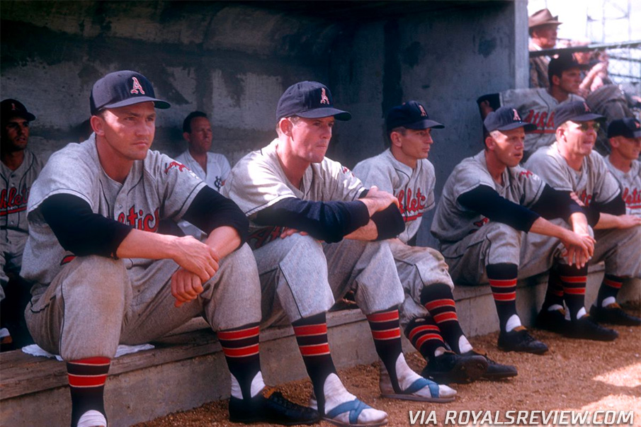
As mentioned earlier, fountains and architecture were not the only elements incorporated into the designs. The use of navy blue as the base color for caps and jerseys was done to pay homage to a few professional baseball teams that once called Kansas City their home. the Kansas City Packers Played in the Federal League, a short-lived “Third Major League” that existed in 1914 and 1915. The legendary Kansas City Monarchswho played in various black leagues from 1920 to 1955, and finally the Kansas City Athleticsthe meat in the Oakland A franchise sandwich, played KC from 1955 to 1967. All of the above wore navy blue as their primary uniform color for most of their stories.
“It’s very important to us, the deep roots of baseball in Kansas City, and what a privilege to have the Negro Leagues Museum in Kansas City,” Tourville said. “Although the Monarchs are not part of the Royals franchise, they are almost like our sister or our cousin. There is a certain sense of pride, and we feel really lucky for that in Kansas City.”
SHOP: Kansas City Royals City Connect jerseys, caps and more available now!
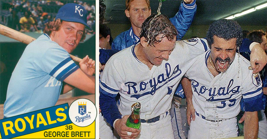
The powder blue and broad stripes took us back to the Kansas City Royals teams of the 1970s and 1980s when sweaters ruled the league, and the Royals were perennial contenders in the American League West, culminating in a victory for the World Series in 1985.
While fans are divided over their opinions regarding the City Connect series, recent unveils have shown merchandise sales through the roofsales records being shattered with each subsequent release.
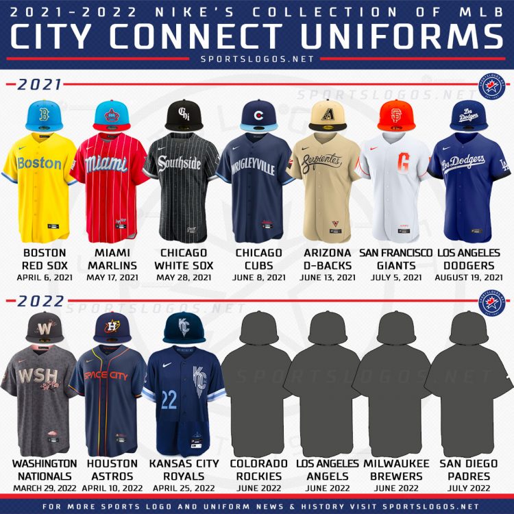
The Royals are the third of seven teams to reveal their Nike MLB City Connect Kits this season and tenth overall. Last season the Boston Red Sox, Miami Marlins, Chicago White Sox, Chicago Cubs, Arizona Diamonds, San Francisco Giantsand Los Angeles Dodgers constituted the charter class of the City Connect club. So far this season we have seen the Washington nationals, Houston Astros, and now the Kansas City Royals. Next come the Colorado Rockies, followed by the Los Angeles Angels, Milwaukee Brewers and San Diego Padres.
The Royals will wear their new City Connect uniform for both this weekend against the New York Yankees and two more against the St. Louis Cardinals a week later. Other games may be announced later. Merchandise goes on sale this morning at 9:00 a.m. CT.
#Fountains #Reign #Kansas #City #Royals #Unveil #City #Connect #Uniform